
We launched a new site for Crimestoppers and increased crime reporting by 25%
-
Client
Crimestoppers
-
Scope
UI & UX Design / Development
-
Key stats
25% increase in form submissions / 400% decrease in site load time
Making reporting a crime easy and quick
Crimestoppers give people the power to speak up and stop crime. For over 30 years the charity has operated a hotline and website where people can report crime with total anonymity.
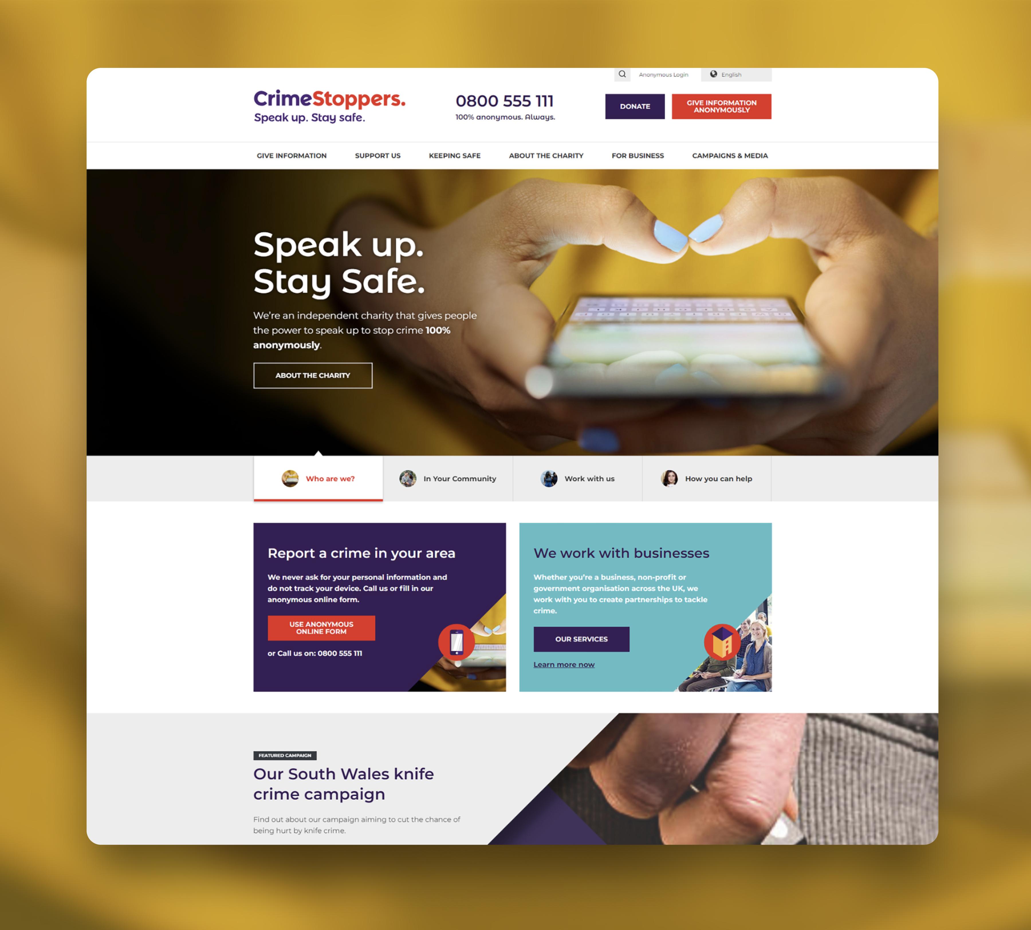
By building Crimestoppers a new website, Kalago made it easier and quicker to report a crime, resulting in a 25% increase in anonymous form submissions and a decrease in site load time of 400%. We also overhauled its donations process, making it clear Crimestoppers is a charity worthy of support.

The challenge
On the Crimestoppers website, reporting a crime just wasn't as easy as it should be and the site was in need of improvement. There was a bigger problem. Who is Crimestoppers?
Crimestoppers was suffering from a big issue with its brand - it wasn't immediately obvious that it was a charity. It was easy to assume it was an extension of the police. If that was the case, how many people were too afraid to speak up? How much crime went unreported? How many lives were being ruined?
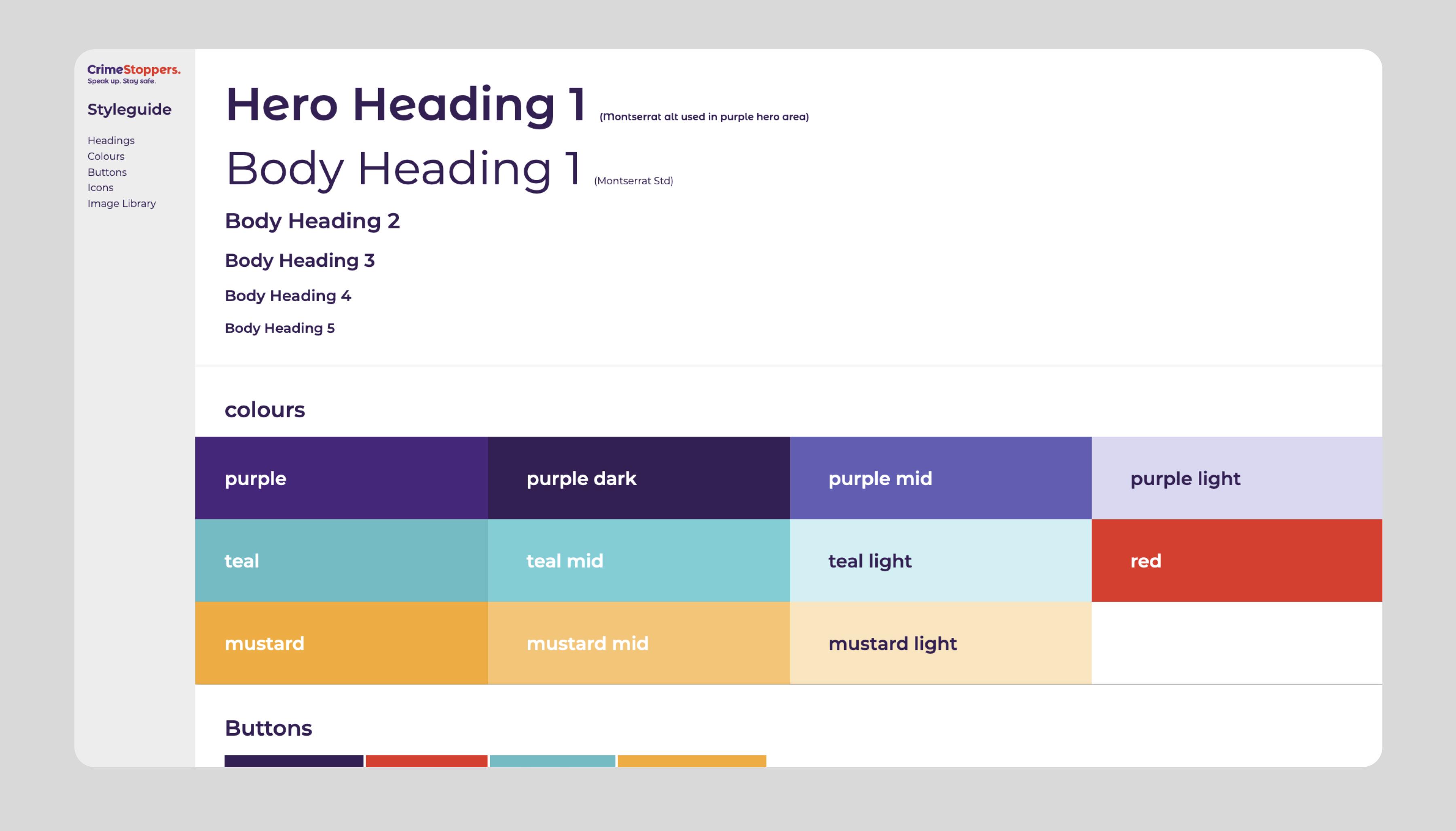
We helped re-position Crimestoppers with a new look and feel for the site, reflecting a revised brand identity. Key messaging was designed to place Crimestoppers away from its perceived associations with the police.


What did we do
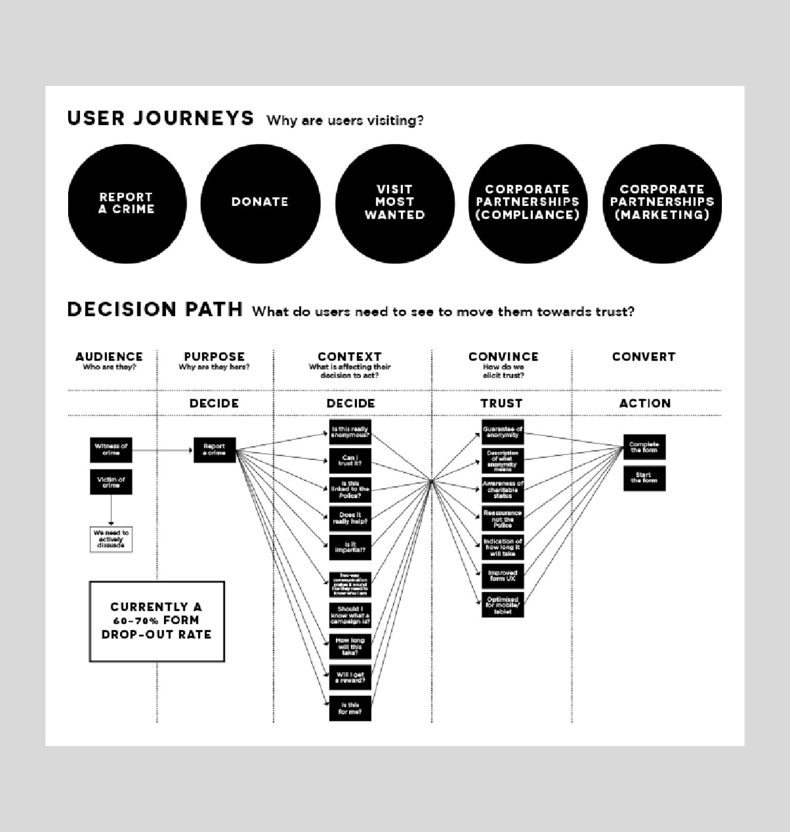
Building a website is complicated. The trick is to make the result look simple. The best way to do this is to ask real people and real users. This meant a series of workshops with Crimestoppers where we arrived at a set of user stories and empathy maps to inform the sitemap and wireframes.
The client was familiar with Kentico and Kalago is a Kentico Gold Partner. When it was time to choose a CMS, it was the perfect platform. Bringing together our Web Development and UX teams, we used a modular approach, creating custom 'widgets' that allow pages to be easily altered.

Anonymity
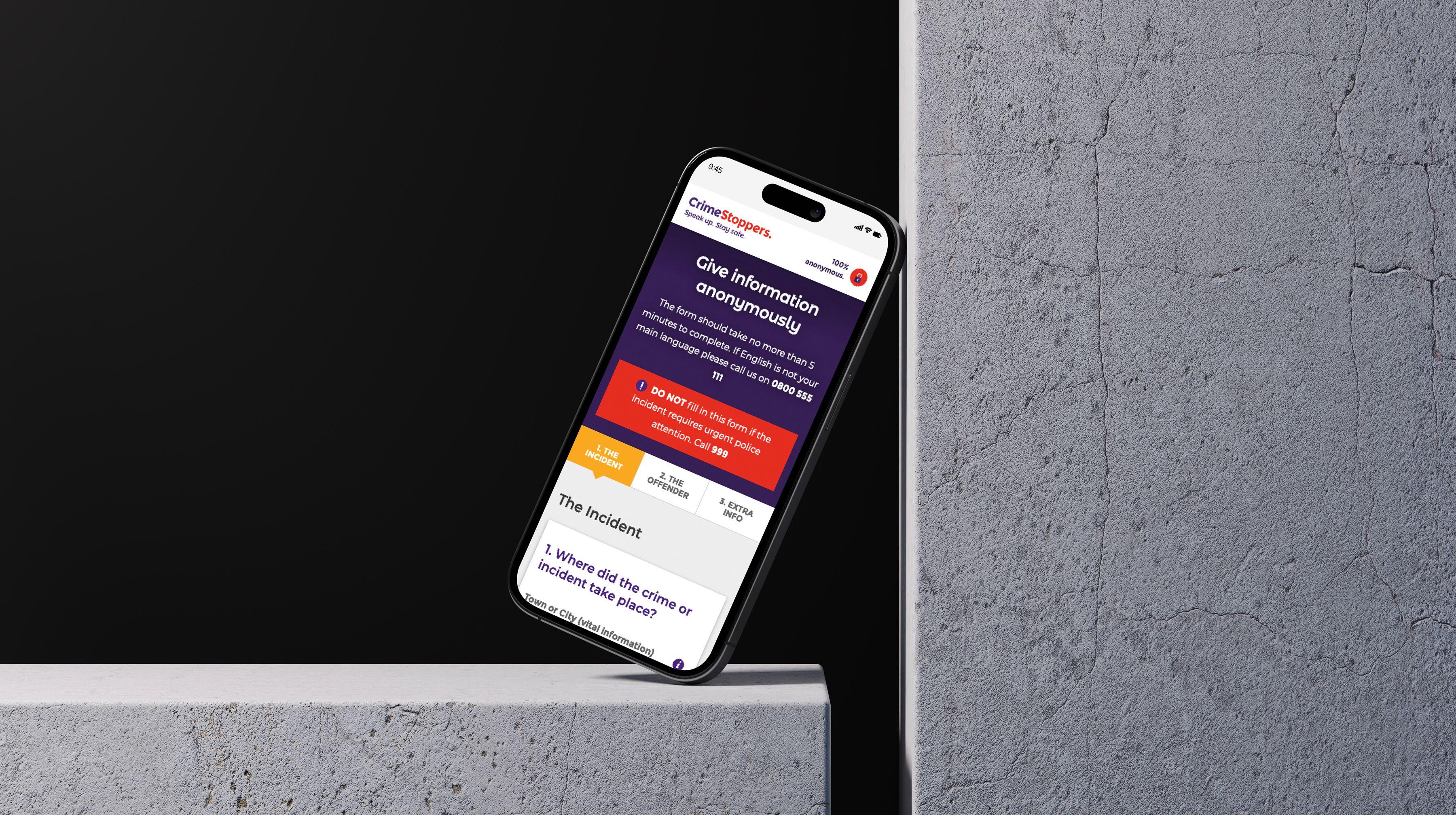
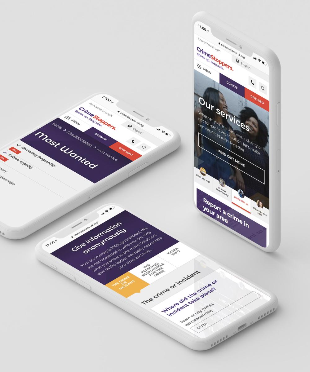
People reporting crimes might have a window of just a few seconds to do so. So, as well as ensuring the new site was mobile-responsive, the anonymous form was streamlined. Containing just six 'flows', users are asked specific questions based on the crime they're reporting.
Donations
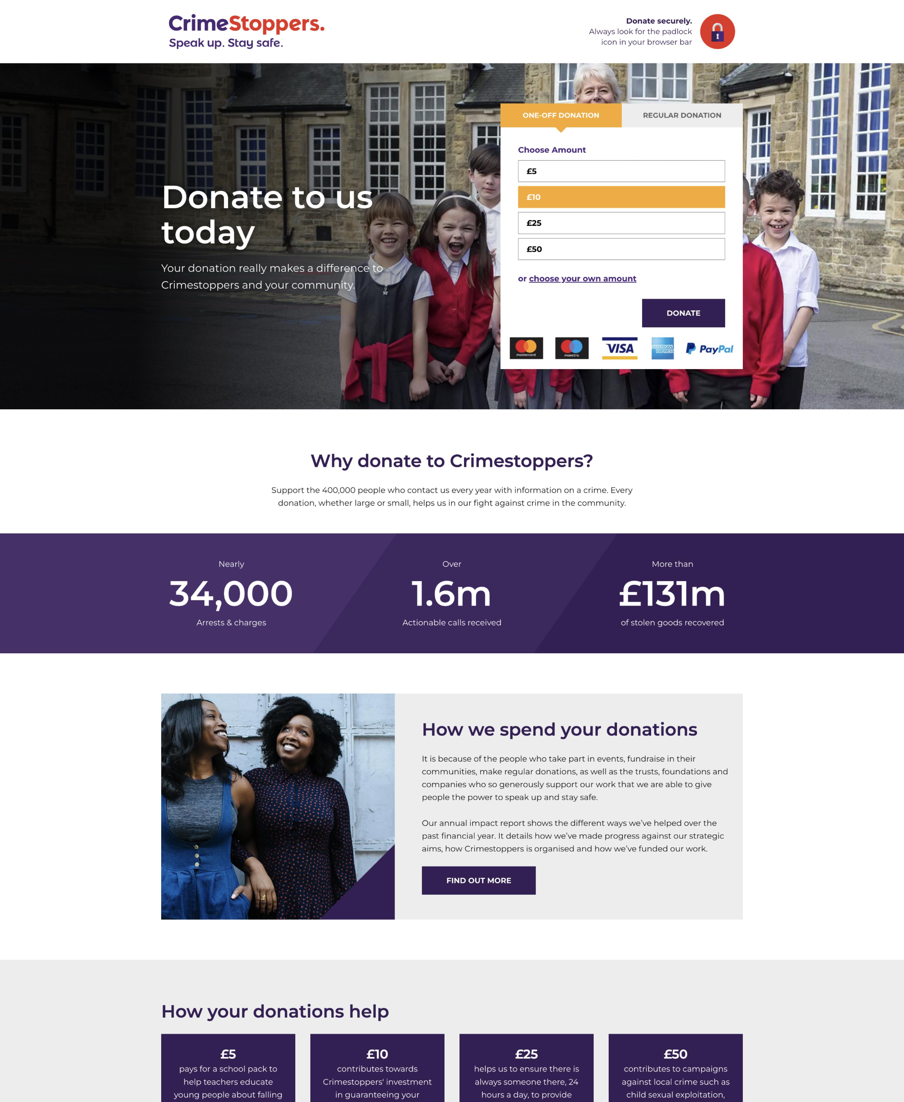
On the old site, donating was a frustrating process. How many users wanted to make a quick donation, but didn't? Giving the new 'donate' button greater prominence on the site also helped address the misconception of the brand.
The whole process was overhauled, with PayPal and SagePay integrations allowing seamless one-off payments. Ongoing donations via Direct Debit can also now be submitted online, meaning the site now has the potential to change Crimestoppers' business forever!
Campaigns and media
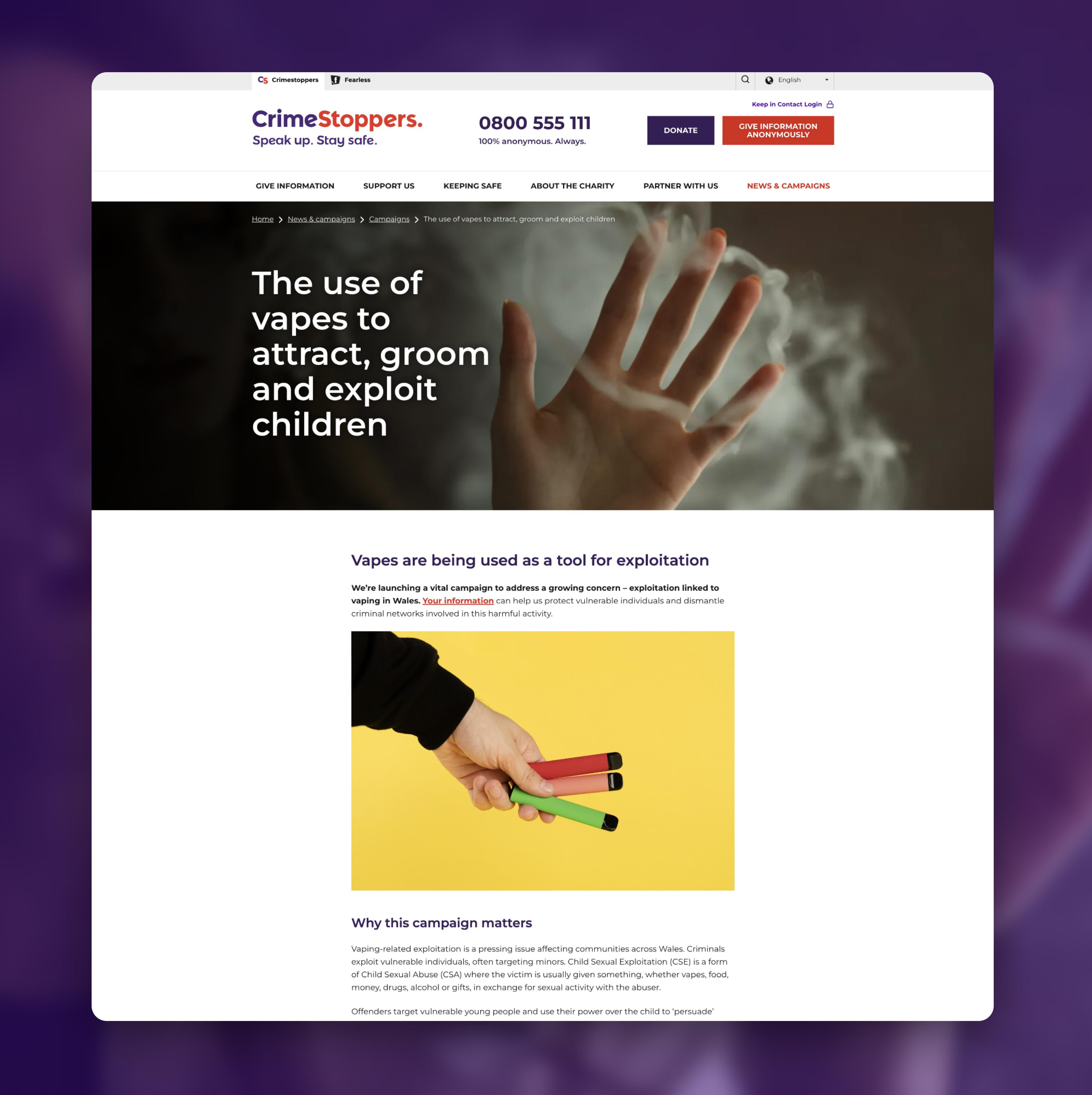
Crimestoppers relies on building partnerships and relationships with businesses. They need to understand the work the charity does and see the results. That’s why we revamped the campaigns and media section. Within this, visitors can read the latest news, view the most recent campaigns or download the latest press releases. Crucially, all this content is easily edited and updated by the Crimestoppers team.

I was impressed by Kalago's understanding of our business and their 'business performance first' approach. Often when dealing with these types of projects an agency is purely technology focused, losing site of the overall business objectives. Absolutely not the case with Kalago; they took the time to truly understand what we were trying to achieve and we couldn't have asked for anything more in terms of delivery and support.
